Last modified: 2007-06-09 by antónio martins
Keywords: air force | sun: rays throughout | propeller | error | hammer and sickle (yellow) | hammer and sickle (white) | star: with hammer and sickle | star: 5 points (red) | anchor (golden) | anchor: winged |
Links: FOTW homepage |
search |
disclaimer and copyright |
write us |
mirrors

In Vlaggen, Standaarden en Wapens, by Preben Kannik
[kan5X], in which this flag is intitled
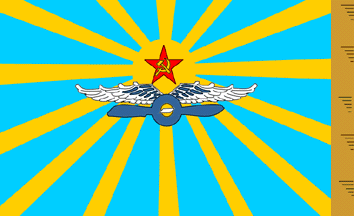
«Luchtmacht» (airforce), it was introduced c.
1924.
Jarig Bakker, 23 Jul 1999
The Soviet Air Force had one of the most beautiful flags ever
made; unfortunately, it is also one of the least known in the
West. A similar design, used as a badge,
ultimately dated back to 3 April 1920. (see plate 15 of Guido
Rosignoli’s Air Force Badges and Insignia of World War Two
[rsgXX].)
Miles Li, 09 Apr 1998
I’ve seen an actual photo of this flag: The shade of blue is light,
yes, and the yellow shade is also light, not golden. The photo is in the
back cover of an issue of Modelist Konstruktor magazine of the
1980’ies.
António Martins, 09 Sep 1999
Regarding the dimension of the Soviet AF flag, there has always been much confusion over its exact design even inside USSR. I have seen several photos of the flag:
The Soviet Air Force Flag is illustrated in both The Flag Book
by Preben Kannik, 1957 [kan57a], page 63,
and “Flags of the World” by Gilbert Grosvenor and William Showalter,
National Geographic Magazine, September 1934
[gsh34], page 394. In both illustrations
there is a black and white set of wings above the propellor. The wings
are partly in the bottom of the disk and partly outside it; the propellor
is outside the disk. In both Kannik and National Geographic there is one
ray reaching each corner, three rays at chief and base, and two rays at
hoist and fly — thus four blue sectors at chief and base, three at hoist
and fly. The central disc was in the Soviet flag slightly above the
centre of the flag — according to Kannik and National Geographic… maybe
even more than “slightly”… The only difference I could see between the
two illustrations is that in Kannik the hammer and sickle is white, while
the National Geo. shows it in gold or yellow. Both illustrations show the
flag with a gold fringe, on the fly end only
Ned Smith, 28 May 1999

From Flaggenbuch [neu39].
Jaume Ollé, 27 Jul 1999

From C. F. Pedersen’s Flags of the World in Colour, 1970
Flaggenbuch [ped70].
Steve Stringfellow, 24 Jul 1999
The Soviet AF flag image of this NGM booklet
[gsh34] is a fairly faithful
reproduction, I would say, except that the rays should be
roughly as wide as the blue “strips”.
Miles Li, 12 Sep 1998
In Vlaggen, Standaarden en Wapens, by Preben Kannik
[kan5X], the image differs slightly
from the one at National Geographic
[gsh34] — the propellor is
relatively longer.
Jarig Bakker, 23 Jul 1999

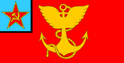
In 1924, the Soviet Union adopted for its Air Force a a design
similar to the earlier flag of the Aeronautic
Section of the Imperial Russian Navy.
Dave Martucci, 24 Nov 1999

Anything below this line was not added by the editor of this page.